Wednesday, June 15, 2011

Butter paper

We don't do a lot of package design here at WOC, but when one of these fun projects falls into our lap, we're always happy to have a think.

This new line of flavor infused butters came into our lives last week.

The client was planning on putting 4 oz. of the product (one stick of butter) into those little plastic tubs that they give you at the deli counter to put olives in, or cole slaw, or a small container of potato salad. Noooo! We screamed. Please don't. After looking into numerous other containers (tiny earthenware crocks from Morocco for example), we hit on the supremely novel idea of putting the butter in sticks. And wrapping them with some gorgeous paper, as seen below.

Imagine going to the refrigerated gourmet section of your supermarket and seeing a stick of this all wrapped up and beckoning to you. Positively regal! That's what it is! The kind of packaging that says: "I'm expensive, but worth it."

Saturday, June 11, 2011

Vodka case study

The account group at Fathom had some research that said people were sick of new vodka brands and all their B.S. advertising. So they decided that Boru would be the no-B.S. brand.

We loved it. And, as it turned out, Boru's main product attribute (apart from being from Ireland) is that it's triple-distilled. An attribute that helped us to latch onto the concept of "clarity" as sort of the anti-B.S. positioning. Once that was in place, the campaign flowed like a Boru-tini: Boruisms. Little gems of wisdom, aphorisms that represent "clarity from Ireland." So much fun to write.

The campaign was a blast to work on and it won a bunch of awards, got a lot of press, and sales went up nearly 500%.

Not too shabby. Here below is some of the work:


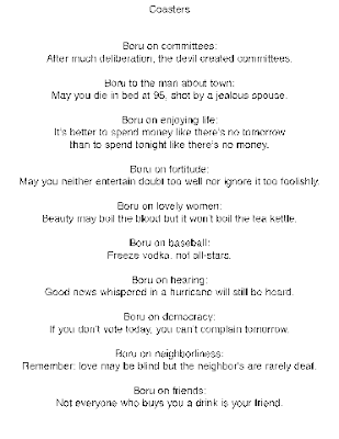
And here are some of the lines we put on coasters:


Brides magazine mini-case study

From the Woodstock Organic Concepts company blog archives:

Like lots of national magazines, Brides has a regional edition and our friend Dave somehow got himself an ad for his professional dj services in the northeast run.

As we always do for such things, we looked around at what everybody else was doing to see the similarities. And as we always do, we noticed that almost all of the other music services ads in the last issue of Brides had a number of elements in common: full color bleed, cheesy pictures of dj's or bands or dancing happy party-goers, and boring typefaces. So, as we always do, we set out to make Dave's ad different. In a smart way. Here it is:


This ad is the latest expression of our big campaign idea for JTD: JTD delivers peace of mind. Unlike most other dj services, Dave carries a million dollars insurance, backup systems and backup dj's, so if you hire JTD there's one less thing to worry about on your big day. "JTD. Free your mind, so your ass can follow."

Political advertising case study

From the archives of the company blog:

Sweet mother of Kennedy! We finished our first soup-to-nuts and pearls-to-swine political campaign last week and it was an amazing experience. Just amazing. If you want to know exactly how amazing, you'll have to buy each and everyone of us here at Woodstock Organic Concepts a few beers to loosen up our tongues. Otherwise, we'll just stick to the facts:

Our guy won. Jeff Moran. Keep Jeff Moran Woodstock Town Supervisor. He won another 2 years as 'mayor' of our small town. It was a long and complicated campaign with lots of players but W.O.C. provided the image management from start to finish, with a little sometimes-but-not-always-helpful input from everyone else under the sun.

We'll spare you all the details and spare ourselves the 5,000 words it would take to tell them. Here's the topline of what we did that helped Jeff win:

1) Once his platform had been written and the competitive environment had been analyzed, we were ready to identify the candidate's unique selling proposition (USP) or brand essence or brand DNA or turf or whatever else you want to call it. For our guy it was "don't mess with success." He was the incumbent and had done a great job during his first term. Everyone said so. We executed this concept by using the format of "Keep (fill in the blank)" for all of his communications, a format we lifted from the suggestion of a past town supervisor who said that Jeff's campaign promise should be to "Keep Woodstock Small and Beautiful". Perfect. Keep Woodstock thriving. Keep the Comeau for all Woodstockers. Keep Woodstock Elementary open. Et cetera. It's positive, it's differentiating, it's ownable. And the candidate liked it. So that format became our hook, our main way of communicating his USP.

2) Jeff Moran's major negatives going into the campaign were that he was perceived as an elitist and as the anti-green candidate. Here's what we did:

a) As there were no other "Jeffs" running in the area, we were able to drop his last name from the bulk of our communications and refer to him simply as "Jeff", working against the elitist perception.

b) We recommended a snappy URL "KeepJeff.com" and helped set up a website that laid out his platform in a simple way.

c) We made his logo out of grass and daisies, turning him instantly 'green', which in fact, he was.


d) We included this message on the website and on all communications: "If you have any questions on this or any issue of town business, please call me at 679-2113 ext. 7." Because really, what kind of elitist public servant passes out their phone number in case you have a question?

3) We relentlessly recommended against print advertising and for person to person contact. For the primaries, we set up a phone tree to reach out to the 700 voters identified as likely to vote. This outreach was our stated number one priority in every meeting with the candidate and his advisors and was based not just on the numbers but also on our category insight that in local political elections, there is always somebody in every cluster of people who knows the inside scoop. The guy next door or down the street or at the meat store who pays attention to this stuff. He or she is the person people look to for "who do I vote for" guidance and so we had to get to them.

4) We set up political committees and letters to the editor campaigns to address the important election topics from a variety of perspectives.

5) We set up Facebook groups and YouTube videos and ran print ads and did door hangers and direct mail pieces and all the stuff that you'd expect. It didn't hurt.

6) We got the candidate out there to every pancake breakfast and soccer Saturday and senior's meeting.

7) And this is the really interesting part: our chief officer sent out a personal email explaining why he was supporting Jeff. It started with the admission that he had begun working on the campaign not as a supporter but as a mercenary, and went on to explain how he had personally been won over in the course of the work. The letter received numerous replies from people saying they hadn't known who they were going to vote for, but now they would vote for Jeff. Wow. In the course of the campaign, our boss had become the guy that people looked to for election guidance and our early thesis was proven correct. He personally swayed votes.

8) Lastly, we stayed cheerful and helpful despite a lot of crap.

As we mentioned, it would take thousands and thousands of words to detail all the work that went into this. If you want them, pay with beer. The more beers, the better the story will get. Otherwise, we hope you enjoyed this summary.

We'll leave you with one of the advertising pieces we liked best from the whole campaign, a print ad for Team Woodstock that sold Jeff as the coalition candidate that he was: (click it to enlarge)

Syndicated radio program case study

From the archives of our company blog:

The best assignments are almost always the ones where we can be brought in on the ground floor. This is what happened with Unleashed, a syndicated radio program that was looking for broader nationwide syndication.

The best assignments are almost always the ones where the clients are awesome. That's what happened with this one: dJ/radio mogul Dave Leonard is thoughtful and insightful and helps us to do our job even better.

Here's how it all went down:
• Product name. The client's other, related business is called JTD, which stands for "Jeffrey the dog." He wanted something dog-centric for this venture too and was using "Unleashed" as the name for his radio program, which is a great name but: a) is already out in the world a bunch, b) is not as descriptive as it could be and, c) was not available as a URL. "radioUnleashed.com", however, was available as a URL. Nicely descriptive, right on, dogwise, and ownable. We bought it. Our client thought it over for a few days and bounced it offa his staff and clients and finally bit: radioUnleashed it would be.

• Parity product. radioUnleashed sorts through all the music that's out there and brings its listeners only the very best of it. Heard that before? We had. Our client even noted that there were a few stations out there on XM and whatnot that promise the exact same thing. We asked him what he did differently than those stations and he told us that he does it better. Now, we, of course, believe him, but still, "we think we do it better" is not much of a hook to hang your hat on. So... not having a serious and ownable point of differentiation to talk about, we decided we could own how we talked about it. Let the other guys bring you the very best of it, we'd "sort through all the kibble and bring you the good bits." Dog talk all the way to the bank.

• Logo. Keeping with the dog theme, we did a bunch of drawings, some were versions of the JTD logo, some were brand new ideas depicting slightly more feral pooches. Eventually we saw a dog hanging its head out a window and the light bulb went off. Lotsa fun, a little indulgence and just a bit of danger, it was a perfect image. A few hours on the drawing board and we came up with the drawing, a little bit rough, a little bit fun, a little bit toothy. We liked it, the client liked it and after a little fine tuning, we had radioUnleashed's new logo.
• Tag line. "Music with teeth." No brainer. It's how we always described the common thread of the diverse range of music we like and now we could give it to our client. Music with teeth. Perfect.
Once the logo and the line were nailed, executing the rest of this stuff was an exercise in fun. Designing the website was a blast and a swell exercise in doggie free association. You can see it here: radioUnleashed.com.
Business cards would have a bite die-cut out of them...
...collateral materials would have the fun logo....
...or even better, they would more organically express the dog theme....
...and what the heck, maybe we should even make some actual dog bones to give out.
All well and good, the radioUnleashed brand is really starting to take shape. Fun logo, great line, and lots of fun executions. What about print ads? Well, just as we were starting to think about that, our client Dave sent us a scan of his playlist from the week before. Handwritten and perfectly descriptive of the kinda music you could hear on rU, it was a thing of beauty. Engaging and lovely and nearly the perfect print ad just as it was. So we threw the logo and line on there and called it done. One of the best, easiest, no-brainer print ads we've ever done. Here it is: (click on it or any of these images to see them bigger.)
We added a laundry list of associated promotional ideas ranging from art show sponsorships, guerilla concert "sponsorships", recording studio sponsorships, and our patented "9 ways to saturate the local bar scene with your image and URL" plan. In the next few weeks, we'll sit down with our fab client and sort all of this stuff into a sensible chronology following our "seed. launch. sustain." scheme. It'll be fun.
So that's the radioUnleashed story. Smart and fun and comprehensive. We're so proud of our thinking and our work and we're so happy to have a client as awesome as Dave. Now all that all of you have to do is to go give it a listen. Go to radioUnleashed.com and click on "fetch" to hear last week's show. It's a great listen. Bow wow wow.