Sunday, December 25, 2016

If only for the clients....


We used to say, all the time, as we were sitting around chewing the fat of the hand that fed us, that advertising would be the perfect job if it weren't for the fucking clients.

And then it dawned on us, yesterday, that it's been a long long time since we've had a shitty client: a snarky MBA hell bent on covering his or her ass with mountains of statistics and focus groups out the wazoo and every. fucking. thing. exactly. by. the. book. Wharton. Ick.

A long time. Honestly, these days our clients have been really really good. Small business owners who are eager to take chances or are instinctually(*) not eager to take chances, people who are calling the shots for their own business and their own brand and it's a blast. Maybe that's the thing: it's great to deal with the people at the top. And that's exactly what we've been doing.

So, what, pray tell, might have led us to these thoughts right now in this forum -- these appreciations for these clients? Well, one Juliet Lofaro. Photographer. Client.  Great client. That's what.

She came to us wanting some branding and a logo and so we sat down and we started talking. And listening. And listening some more. And right away, it came out that, at her core, she's not just a photographer, she's a portrait photographer. And that was a nice thing for her: to define herself that way and so we did, too. But even more than that, she seemed to be a serious thinker about her work and her craft and that led us to jump the gun a little bit and send the following email (which had no salutation - wtf?):

Philosopher/photographer, continuer of a noble tradition. Builder upon the shoulders of the giants who came before. Thinker and doer whose thoughts and deeds are captured in a fraction of a second.


“A portrait is not made in the camera but on either side of it.”
                                    - Edward Steichen

“The heart and mind are the true lens of the camera.”
                                    - Yousuf Karsh

“My job as a portrait photographer is to seduce, amuse and entertain.”
                                    - Helmut Newton

“To photograph truthfully and effectively is to see beneath the surfaces and record the qualities of nature and humanity which live or are latent in all things”
                                    - Ansel Adams

“In a portrait, I’m looking for the silence in somebody.”
                                    - Henri Cartier-Bresson

“When people look at my pictures, I want them to feel the way they do when they want to read a line of a poem twice.”
                                    - Robert Frank

“The most emotionally resonant photos are portraits, capturing the soul of a person, place or thing.”
                                    -Juliet Lofaro,
                                      portrait photographer


Juliet, your branding is clear to me. I’d love to talk with you more about this direction and how you feel about it and maybe even how to express it out in the world.


Well, she liked these thoughts a lot and we were able to put the cart back behind the horse and proceed with our proprietary branding questionnaire. Now, this questionnaire, 40 or so questions, never fails to identify a client's brand essence and Juliet filled it out and we filled it out and then we all compared notes and agreed that really and truly, what she should stand for in the minds and hearts of her customers was "connections." The connection between her and her subjects that's documented in her camera and the connection between the resulting photo and those who see it out in the world. Connections.

So, next step, we started a logo exploratory, searching for ways to graphically represent the concept of connections. Here are some of the first round ideas, incorporating her new job description "Portrait Photographer" instead of just "photographer":


Two fingers on two shutters, representing connection.
Getting inside of the head of your subject.
Getting inside of the head of your subject, line drawing version.
Getting inside the head of your subject through conversation.
We'd sent along some others, too, but these are the highlights and, also, we were REALLY excited by two of them in particular: #3, the line drawing of overlapping faces and #4, the conversation bubble with the camera lens in the middle. 

Well, as so often happens, out client was not as excited as we were, though she kinda liked the idea of using a stylized camera iris and kinda liked the idea of using her signature, so we went back to the drawing board


Adding the signature to the conversation bubbles.


Adding a heart to the stylized camera lens, with the heart standing in for the concept of "connection".
A graphic version of "connection"built on the similarities between the upper case "J" and "L".
A further exploration of the "J" and "L" connection.
And, finally, though she didn't really dig it, another push for this line drawing head, this time with signature!


Well now, at this point, our esteemed client had a favorite: the heart inside of the camera lens. She felt that it expressed the idea of "connections" just fine and had the legs to look good on a variety of merchandise, etc. So we began investigating various versions of that...


Different fonts, different hearts, and getting closer and closer to a great logo. And then, one morning, in the morning fog of recently departed slumber, it dawned on us! We didn't want a heart inside the lens, we wanted the lens inside the heart!! So after a couple of rough sketches and a conceptual "ok" from our client, we went ahead and looked at some finished roughs of that:


And then, with only a few more adjustments and explorations, we'd found our logo. (Top below) But instead of looking at it as static design, with the heart always in between the "Juliet" and the "Lofaro", we recommended thinking of the logo as a collection of 3 unique elements: the icon, her name, and her job description. Implementing Dynamic Design™ in this way gave us a lot of flexibility for various logo applications.

And that's the real, true story of Juliet Lofaro, Portrait Photographer. And the connection we made with her, and the connections she makes with her subjects, and the connections her photos make with their audience. 

Advertising, it's kinda the perfect job after all. Or maybe we're just lucky to have perfect clients.
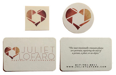
Temporary tattoo, sticker and business card, front and back.

Thursday, June 23, 2016

Young Rhinebeck branding and logo


Young Rhinebeck was (is) a wonderful community-based, volunteer-led not-for-profit organization based in the Mid-Hudson Valley town of Rhinebeck, NY.  Its signature program links English as new or English as second language (ENL & ESL) elementary school students with Bard College tutors to help with homework, enhance language skills and to provide translators for parents to help nurture connections and engagement with the family, school and broader community. Young Rhinebeck also offers world-focused events to fill in the second half of district-wide half days (Half Day/Whole World), world-intensive semester-long programming (World Connect) and arts programming, which had consisted entirely of a sleepover "Night at the Museum" at Bard's Hessel Museum. 

Their brand definition was non-existent, and for an organization that offered such a disparate range of services, it was not immediately apparent what they should or could reasonably stand for, in terms of branding. While the programs had enormous success and respect from the school system and participants, Young Rhinebeck was missing an opportunity to demonstrate their impact within the larger community and among donors.  In addition, YR wished to expand their programs to new school districts, so making a compelling case for the brand and what it could bring to new districts was essential.
 

One thing the board was immediately open to was a logo exploratory, just one part of the branding process, as we've written about extensively. (Read our essay "The Tortoise and the Hare" here.) Well, we love creating logos, and so we were happy to indulge. Here below are a few of the rough concepts we presented.
Now, as it happens, sometimes when a client delves into the process, they start to understand more and more of the possibilities and at this point in time, the Young Rhinebeck clients indicated that they were maybe kinda definitely open to the idea of changing the name!! Well, we liked that idea a lot and took the opportunity to engage them in a top to bottom rebranding.

So we sat down with the Board and talked about branding and what a brand is and how we work and then we sent them all home with our proprietary brand questionnaire to fill out. 50 questions about the brand and the target and the competition and whatnot. And when each of them had filled it out, we went through it and, as if by magic (seriously: it almost always works this way!) a predominant theme emerged. A brand essence, if you will. "Connections." Young Rhinebeck makes connections. Their LLL program connects ESL kids to their studies, their school and community, and to each other; the other programs connect different constituencies to different cultures and to the arts.  Connections.

So, with this in mind, we did an entire name and URL exploratory (good URL's are getting harder and harder to find) and ended up on "CultureConnect" and www.CulCon.org. Nice name, nice URL. Now we started making the logos.


'


Really, if we could be absolutely brutal here . . . not our best showing with the stuff above. But at some point, thinking about connectors (we do kinda love the staples above, abstract as they might be), we thought about puzzle pieces. Connecting other pieces to a bigger whole. Well, we liked that idea and ran with it.


Eventually we landed here (below) and realized that the position of the name under the graphic would also work to define the left side of the graphic. The letter "C" on the left of the globe-filled puzzle piece "C" on the right. (scroll down)

Et voila!! With a million tweaks between the version above and the final version below, our new name had a new logo!. And this, we don't mind saying, really IS our best showing:


The new logo successfully created a distinguishing visual identity of CulturalConenct’s brand with an immediate strong sense of mission and purpose.  

Now with the branding complete, the new name and the new logo, there were a few more things to do. We worked out a streamlining of the mission statement:

CultureConnect prepares youth
to interact with their local and
global communities with intelligence,
compassion, and cultural competence.

We got a banner and marched in the local Memorial Day parade . . .


. . . and we've created an award for a graduating senior who has served CultureConnect over the course of their high school career. It will be given out in front of the thousands of people who attend H.S. Graduation ceremony every year.

In addition, Woodstock Organic Concepts wrote and produced a wonderful video explaining CultureConnect's LLL program. You can see it here:


So, that's our story about branding Young Rhinebeck. Almost. You see, one of the new programs this newly branded organization has come up with is a 5 week trip to Madagascar, where the second language is French. Well, it turns out that "cul" and "con" are slightly vulgar French slang that we didn't want to be advertising in our URL. Luckily, we caught this before the URL went out into the world (one of us here at WOC lived in France and remembered at the last minute) and so now the new URL is:


And CultureConnect, with its newly unified and recognizable brand identity is poised for even greater good.

Thursday, April 10, 2014

Fashion-forward raincoats case study

When the makers of a line of fashion-forward women's rain coats came to us for branding help, we were flattered and excited to be a part of it. 

As is the case with so many clients, this one couldn't wait to get going, and so branding became a consideration that came after many creative decisions had already been made -- decisions that should have been made seeing each one as an opportunity to express the brand essence. 

As it so often happens, these decisions were made prior to undertaking a deep understanding of the brand and what it should stand for; and while that's never ideal, it's also never a cause for despair. If the brand essence identified is strong enough, it can shine its light on all prior creative decisions. (Naturally we prefer putting the horse of branding in front of the cart of brand expression, even though we don't always get to work that way.) 

In this case, the client had already decided on a name, a logo, and a tag line. Though none of them really expressed what we later came to understand as the brand essence, none of them were bad at all. They also already had a website up and running.

The name and the logo:


We brought a good category insight to the job:


And used it to set up their positioning:


And their brand essence:


We created a mood board to show the kinds of imagery that we felt best expressed the brand:


We wrote a swell brand manifesto:


And gently inserted a tag line that expressed the brand essence:


Each of their coats is named after one of the women in their company; we wrote some product descriptions that showed how even the simplest copy could be worked to express the brand essence:


And we even re-wrote their "about us" page.


That's the She Reigns story at Woodstock Organic Concepts. The company has since put all their operations on hold as they re-tool and re-assess, but it's been great fun working with them and we're proud of the work we did. We look forward to helping them out in the future, no matter where their path leads . . . 


Monday, December 9, 2013

Woodstock Public Library branding

The old logo

The Woodstock Public Library was a great gig. Client Amy Raff had a great understanding of her organization, which makes our job a lot easier. Still, we did an entire branding identity campaign for them, met and talked and filled out our special questionnaires and talked some more and finally a theme emerged: the library provides services. All kinds of things pointed to that as the main theme of what they did.

Having thus identified their brand essence, it just took a tiny twist to understand what their brand personality should be. Instead of stopping at 'service' we went one step further and translated it what that meant for the library's clientele: access. Access to books and ideas and thoughts and like-minded individuals. Access to readings and craft sessions and the internet. Access, access, access. Everything that the library offered could be summed up under the conceptual umbrella of "access." Well, the client loved this idea and so we started executing.

Most clients need advertising: print and radio and sometimes tv. The library only needed a logo. For now. Our first step is to take a look at the competitive environment. Woodstock and environs have, as you'd expect, some nice logos and some crummy ones. A popular thing around town is to use the elements from the 1969 music festival for things bearing the Woodstock name. We were not interested in that.


We wanted something original and ownable, not something derivative and evocative of a music melee that happened 50 miles away.

So we started thinking about how to represent the concept of access with an image and/or maybe an image and a tag line. As a starting point, we thought about a door. It nicely represented the big brand idea of access. Also, the library was currently using a lovely illustration of the front of its building in its materials and there was a door in it. So we took a look and it looked pretty good. Combined with a tag line about access, it could be a sweet little logo for our sweet little library.


Well, we liked the door idea and so put pencil to paper to see what happened (something fun always does) and we started thinking about open books as another nice (and certainly apt) representation of the idea of 'access.' And we started thinking about combining the books and doors and slapping a fun type treatment on there. Well, some of the doodles are below.


We wondered if the open door could be made to look like a big "W" or if the open book could.


We experimented a little with the fun combination of letters 'W', 'P', and 'L'.


We pursued that direction a little bit and while it looked real good, it didn't really relate to 'access' directly. 


Oh sure, we could slap on a tagline to add the thought of access, but for now, we were looking for the something a little more organic and so we forged on. We liked the door, which, it turned out, with a little perspective, could be made to be kinda 'W' shaped or even fit inside of a big block 'W'. Here below are some of the sketches:


Once we had the big 'W' shape, it seemed like we could really just put anything inside of it, a door, an open book, anything. Also, one of the client's mandates had been that the logo be iconic and ubiquitous. Now the latter is largely a question of media placement . . . 


. . . but the former is a matter of design and that big 'W' was already starting to feel iconic. We pixelated the pages from the book in a nod to the digital era, cut off the type a little, in order to make it more unique and ownable and bam! we had the logo below. (Which we love!)


Next, we came up with about a hundred tag lines to help express the idea of access and we finally we all agreed on this one: "open doors, opening minds". Here's the new logo with the new tag line. Iconic and nicely representing the brand. (If we do say so ourselves.)


Business cards:


Letterhead:


And that's all she wrote! We were well paid for our efforts and can't wait to see the logo all around town. Its first uses are going to be in fundraising letters and come-ons for a capital construction campaign, and naturally, we've got lots of ideas of how to make a splash with that, but, sadly, the library already has a fundraising person working on those questions. We're just happy to do our part and hope that, very soon, the library will stand for 'access' in the minds of everyone around.